VCheckBoxGroup
A collection of CheckBoxButton elements used to implement multi-selection or single-selection functionality.
Basic Usage
Use the ItemsSource property to bind data.
The SelectedItems and SelectedItem properties are used to retrieve the selected data.
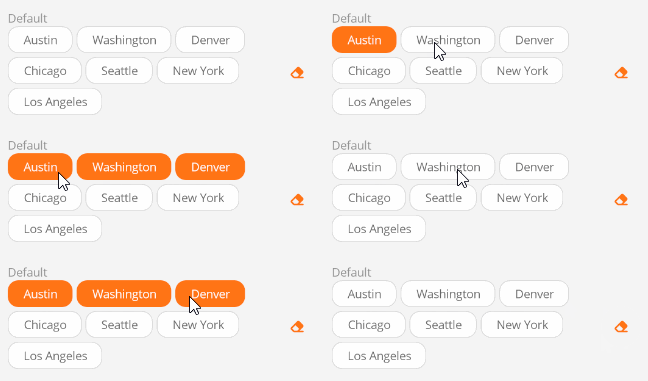
<control:VCheckBoxGroup ItemsSource="{Binding CityList}"/>
ViewModel:
CityList = new ObservableCollection<string>()
{
    "Austin",
    "Washington",
    "Denver",
    "Chicago",
    "Seattle",
    "New York",
    "Los Angeles",
};
Set the DisplayPropertyName property to specify the display property.
<control:VCheckBoxGroup DisplayPropertyName="Title"
                        ItemsSource="{Binding CityList}"/>
Single Selection
Set the IsSingleSelection property to True.
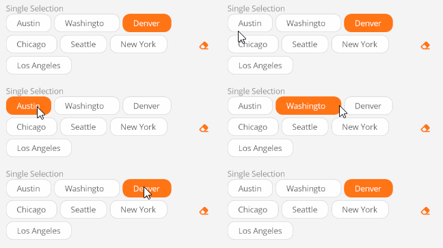
<control:VCheckBoxGroup ItemsSource="{Binding CityList}"
                        IsSingleSelection="True" />
Remove Button
Use the HasRemove property to show or hide the remove button.
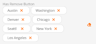
<control:VCheckBoxGroup ItemsSource="{Binding CityList}"
                        HasRemove="True"  />
Change Orientation
Use the Direction property to change the display orientation of the checkboxes. The default is Row.
Available orientations:
- Column - Stacked vertically.
- ColumnReverse - Stacked vertically in reverse order.
- Row - Stacked horizontally.
- RowReverse - Stacked horizontally in reverse order.
Vertical stacking:
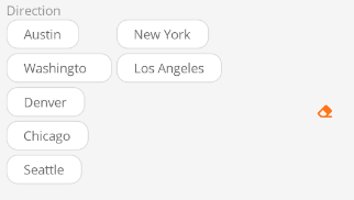
<control:VCheckBoxGroup ItemsSource="{Binding CityList}"
                        HeightRequest="200"
                        Direction="Column" />
Reverse horizontal stacking:
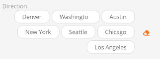
<control:VCheckBoxGroup ItemsSource="{Binding CityList}"
                        Direction="RowReverse" />
Disabled State
Make checkboxes unavailable.
Set the Enabled property to False.

<control:VCheckBoxGroup ItemsSource="{Binding CityList}"
                        IsEnabled="False" />
Hide Clear Button
The clear button is used to remove all selected items. If it is not needed, set the HasClear property to False.
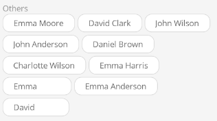
<control:VCheckBoxGroup ItemsSource="{Binding CityList}"
                        HasClear="False" />