VCheckBoxButton
A button that toggles between two states, typically used for simple mutually exclusive states (e.g., "On" and "Off").
Basic Usage
Basic usage of the CheckBoxButton.

Use the IsChecked property to set whether it is selected. This property supports two-way data binding.
<control:VCheckBoxButton Title="CHECKBOX BUTTON" IsChecked="True"></control:VCheckBoxButton>
Disabled State
Checkbox in an unavailable state.
Set the IsEnabled property to False.

<control:VCheckBoxButton Title="CHECKBOX BUTTON"
                            IsEnabled="False"></control:VCheckBoxButton>
Custom Content
The ContentSlot property can be used to set custom content for the CheckBoxButton.
CheckBox with an icon.
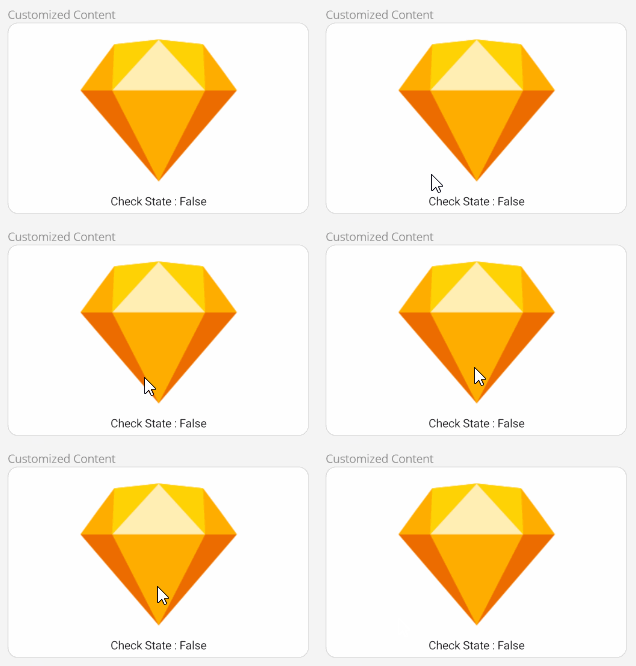
<control:VCheckBoxButton Title="CHECKBOX BUTTON"
                         IsChecked="True">

    <control:VCheckBoxButton.ContentSlot>
        <VerticalStackLayout>
            <Image Source="download.png"
                   IsVisible="{Binding IsChecked}"
                   HorizontalOptions="Center"
                   VerticalOptions="Center"></Image>
            <Image Source="sketch.png"
                   IsVisible="{Binding IsChecked, Converter={StaticResource InvertedBoolConverter}}"
                   HorizontalOptions="Center"
                   VerticalOptions="Center"></Image>
            <Label Text="{Binding IsChecked}"
                   HorizontalOptions="Center">
                <Label.FormattedText>
                    <FormattedString>
                        <Span Text="Check State"></Span>
                        <Span Text=" : "></Span>
                        <Span Text="{Binding IsChecked}"></Span>
                    </FormattedString>
                </Label.FormattedText>
            </Label>
        </VerticalStackLayout>
    </control:VCheckBoxButton.ContentSlot>
</control:VCheckBoxButton>